Brand Identity + Communications
Moving Edson & Area
Brand identity transformation, digital presence and website design for a community-focused accessible transportation organisation serving Edson and surrounding areas.
- Client
- Moving Edson & Area
- Year
- 2024
- Role
- Brand Strategy + Identity + Communications, Website Design
360°
Complete brand identity transformation
01
Unified digital presence
100%
Consistent brand experience across key touchpoints
The brief
With over four decades of community service, Moving Edson & Area had an established reputation for providing safe and reliable transportation. However, its evolving services and broader audience called for a brand identity that better reflected its mission. The challenge was to move beyond the traditional perception of a seniors' transportation service and create a more inclusive, contemporary brand that communicates accessibility, independence and connection.
Approach
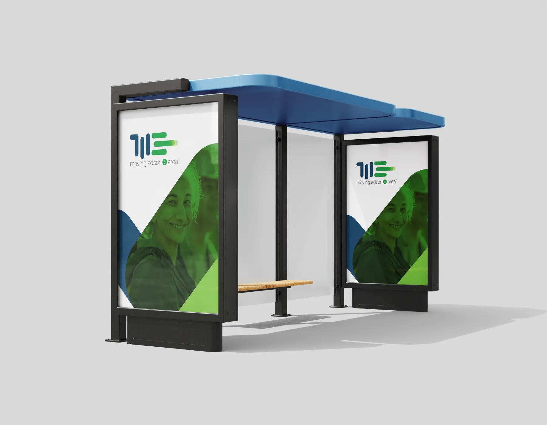
We approached the transformation with a simple but meaningful idea: movement is more than getting from one place to another; it's about staying connected to life.
This became the foundation for the brand's strategic and creative direction. The refreshed identity was designed to feel welcoming, accessible and recognisable, while retaining the trust and familiarity built through decades of community service. The digital experience was equally considered, making it easier for users and their families to understand available services, navigate information and take the next step towards booking a ride.
Details that mattered
- A refreshed visual identity that communicates movement, accessibility, inclusivity and community connection.
- A contemporary colour palette and typographic system designed for clarity, recognition and accessibility.
- A cohesive brand language across digital and physical communication touchpoints.
- A user-focused, responsive website that simplifies service discovery, eligibility information and booking enquiries.
- Clear content structure and intuitive navigation to support users with varying accessibility and digital needs.
Next case study
NTERIO